Grochowski Construction
For Grochowski Construction, a Polish manufacturer of modern prefabricated modular homes, we designed a new visual identity and website. The aim was to build a contemporary premium brand that brings together advanced construction technology, sustainability and a personal approach to working with clients. The visual system was designed to work consistently across digital communication, marketing materials and the physical environment of the company.
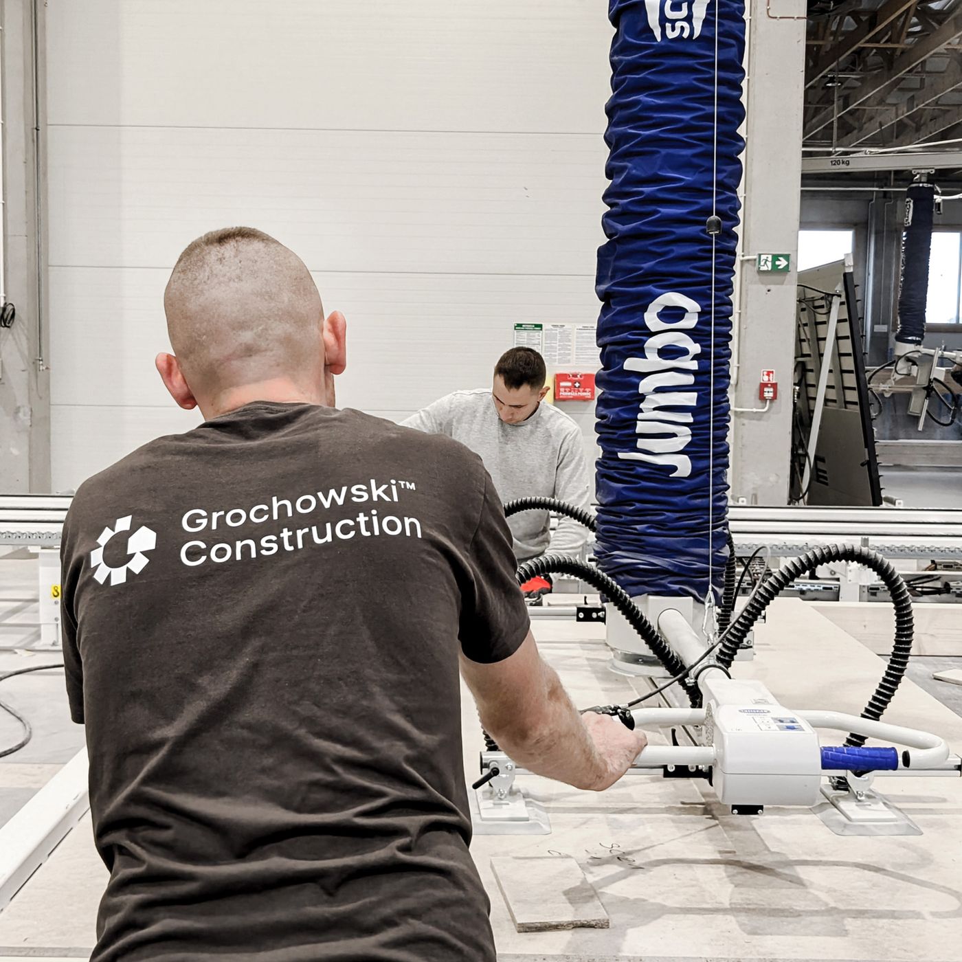
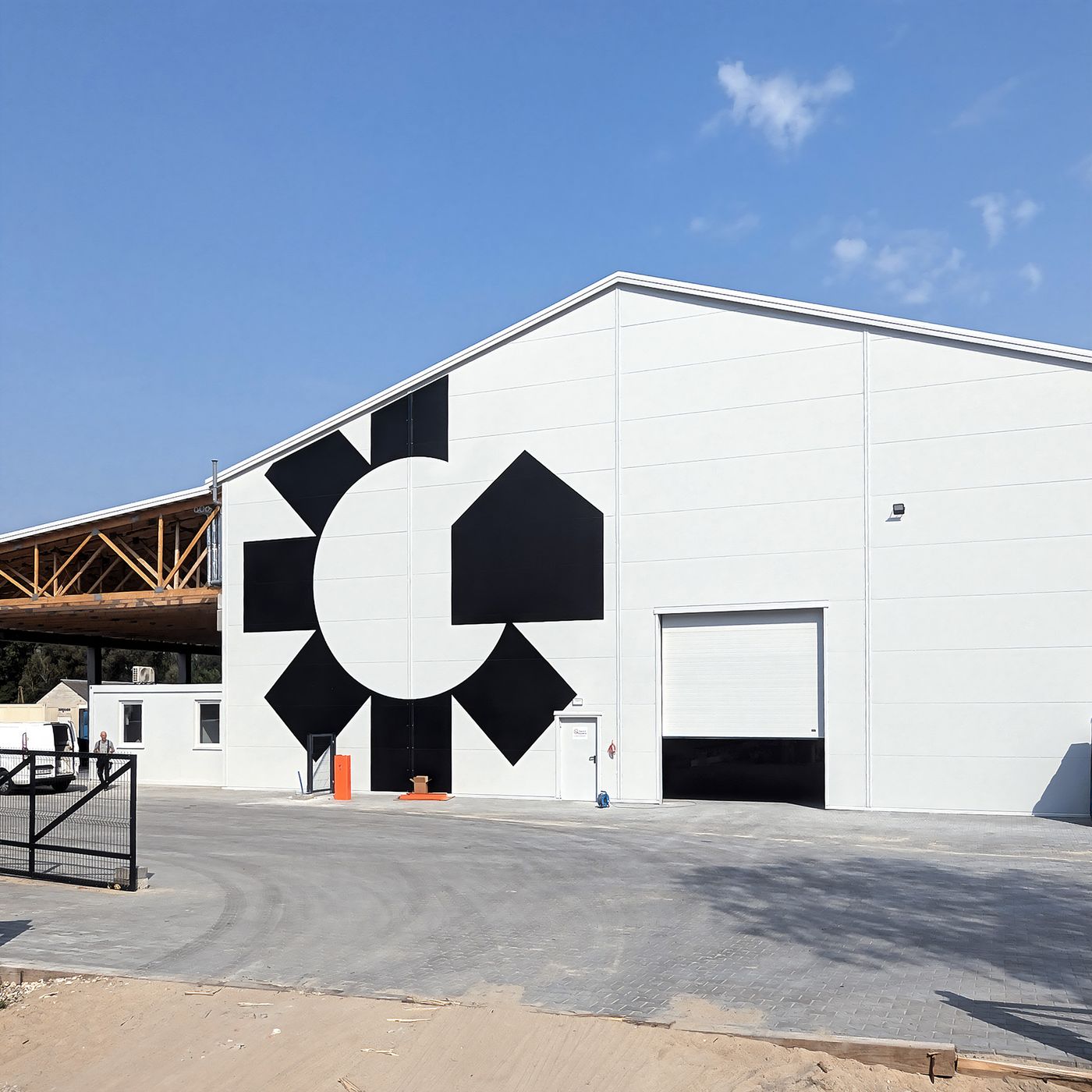
We developed the identity in close collaboration with the Grochowski Construction team, translating their expertise and offer into a clear, scalable visual system. The logotype combines the idea of modular construction with a subtle reference to the brand itself: its geometric structure suggests individual modules coming together, while the negative space conceals the letter “G” from Grochowski. The colour system gives the identity a practical layer of navigation. Three distinct colour codes correspond to the brand’s key areas — technology, ecology and client collaboration — and are consistently applied to services, website sections and content. This allows users to immediately recognise what a particular piece of information relates to, while helping the brand organise and expand its communication without losing clarity or consistency.
One of the key challenges was designing a distinctive mark for a relatively long brand name while ensuring that it remained flexible enough to work across very different formats and scales. The identity needed to perform equally well as a small digital avatar, where every detail has to remain legible, and as a large-scale application on a factory façade or the side of a truck. We therefore focused on creating a simple yet highly adaptable geometric form, capable of retaining its visual character regardless of size or context. Its modular construction not only reflects the nature of Grochowski Construction’s product, but also allows the mark to become a versatile building block within the wider identity system. This flexibility became particularly important in developing a premium brand that needed to operate seamlessly between architecture, production, digital interfaces and everyday communication.
see more